
Tour de France – Red, White and Blue…and Green…and Pink
The Pro peloton are usually a colourful bunch and this years Tour de France is no different. But who needs to take some advice from Europe’s fashion capitals and who are the trend setters?
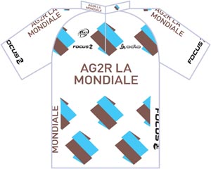 |
The ‘A Gé Deux Erre‘ name has been a part of the peloton since 1992 and previously had a quite tasteful blue/yellow/white colour combo. So nice were their jersey’s back then that they are some of the most visible ‘retro’ jerseys out on the roads of Europe.
Nowadays it’s a different matter! Although they are still rocking the brown shorts, we seem to have got used to their choice of hues and just accept them for what they are. This jersey is like the very ugly person who sits near you in the office – you understand that they need to be there and they perform a function… you’d just rather not look at them whilst they do it! |
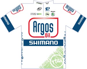 |
Relative new boys to the peloton, Argos-Shimano are an evolution of Skil-Shimano who were always praised for a wonderful looking jersey. We did not have to endure the less than favourable 1t4i kit for too long before we got this offering.It’s not too busy and at the moment there isn’t a flood of white jerseys in the bunch so they are pretty easy to pick out, especially when the gigantic Marcel Kittell is hammering towards you like a streak of white lightning. They have similar colours to other teams but thankfully have thought about how to be different and thus stand out from the crowd. |
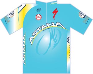 |
An individual colour in the peloton, Astana are easy to spot and have had a fairly consistent design over the years, which is a good sign of a strong design. They are a team that have not always been in the limelight for the right reasons and I’m sure they often wished they were able to blend into the crowd a little easier. With a strong team of all rounders at this years Tour except to see them in just about every situation other than a full on bunch sprint. It’s become a classic due to its unchanged design and it’s easy to spot, so it does get at least two thumbs up. |
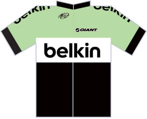 |
The newest jersey on your screens this July, the relative quiet ‘arrival’ of Belkin Pro Cycling confused a few of the Twitterati yesterday. With the demise of Rabobank in 2012 and the Blanco scramble to keep it all together, Belkin have now come on board as chief sponsor. It’s always exciting to see a new jersey come in and depending on the title sponsor, the new jerseys can be quite exciting. I’ve no idea if ‘yummy green’ as I’m calling it is a corporate colour of Belkin’s but I bloomin’ well love it. So much so, I painted my sitting room in a very similar colour… albeit 6 months before this jersey hit me between the google-balls. The Blanco jersey was 100% awful and I’m glad to see it gone. It’s different, clean, simple… like me. I like it. |
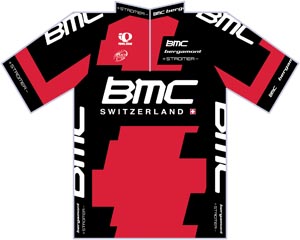 |
Quickly becoming a classic, BMC’s digital red and black design is easy to spot in the peloton and always seems to produce equally nice national jerseys, although Michael Schar’s current Swiss Champs jersey looks a little bit like they’ve had to stretch it over him and the print has ended up in the wrong places. With the likes of Cadel Evans, Phil Gil, Taylor Phinney, Thor Hushovd and Tejay van Garderen in the this is one of the most visible teams at the front of the bunch and thankfully it’s tasteful enough to do them all justice. It’s a jersey that has only been around since 2007 bu it already feels like a classic. |
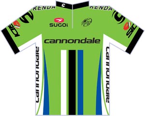 |
With its obvious lineage from Liquigas, the distinctive green of Cannondale has remained even if it has darkened in colour a little to make it more palatable. I’ve always thought green is a difficult colour to use in a jersey but as I write this I realize I love all 3 of the predominantly green jerseys in the bunch! A loud, lime green kit needs a suitably loud and outrageous rider to fill it and oh my does Sagan fulfill that role. Can you imagine his Cav-riling celebrations whilst clad in that AG2R brown nonsense!?!?! I rest my case. |
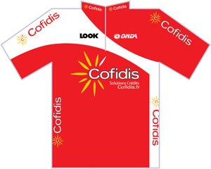 |
I just checked the history books and although I initially thought Cain and Abel had been the first pair of brothers to ride in the Pro peloton clad in the red of French loan giants Cofidis, it turns out the team has only been around since 1997. In cycling team terms, 16 years is a long time and although they have been through some tough times, they are back in the top tier now and the Cofidis jersey has remained pretty much unchanged over the years. Another ‘classic’ French jersey that is often seen on the shoulders of mortals, just with a few more stretch marks and grease stains than Jérome Coppel may sport. |
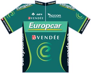 |
“HOLD THE PHONE” It’s green and it’s one of my favourite jerseys’s out there. I’m still not brave enough to own this Europcar jersey, mainly because I’m a bit (a lot) of a kit bitch and it wouldn’t match any of my bikes. Hhmmm… that was fairly cathartic! It’s subtle, classy and manages to find a third way of using green without it looking like they’ve copied the others.As an evolution of Bbox Bouygues Telecom, who themselves had a pretty snazzy kit design, when I see this I just hear ‘FRENCH’… I wouldn’t want to see Tommy V in anything else! It won’t float everybody’s boat but if you are looking for a refined and restrained jersey with heaps of class, go green. |
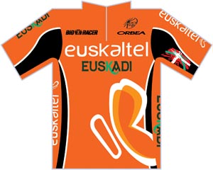 |
Now the Rabo’s have sadly departed the carrot-like Euskatel-Euskadi boys are even easier to pick out. With strong ties to the Basque government and used as an unofficial Basque National squad this jersey and it’s predecessors has been around since 1994. For a team with such a loud jersey design, they are rarely seen at the front of a race taking any real glory unless they are in a breakaway and it’s unlikely if they did not have such strong support from the Basque government they would have disappeared years ago. It stands out from the crowd and has remained relatively unchanged over the years so they must be getting something right, but it’s not a jersey people would rush out to buy and wear on the next bunch ride. |
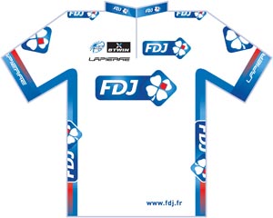 |
Look hard for this FDJ jersey this July… look really hard… because it’s not there. They have chopped and changed the blue and white jerseys over the years and sometimes appear to change them according to the time of year, wearing blue in the winter and white in the summer, which when trying to control body temperature out on the road all day is not a bad strategy. They have gone with blue this summer and quite nice it is too. Another French classic, it’s another personal favourite of mine but does not really stand out from the crowd… which is what it’s supposed to do! |
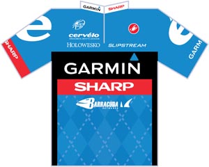 |
The latest incarnation of the Garmin brand in the Pro peloton, Garmin-Sharp has toned down the famous Argyle pattern and is fast becoming a classic modern jersey. Despite evidence to the contrary in the form of Tyler Farrar’s results, this jersey is not made out of super sticky material that grips the air and slows you down. With the current sponsorship duo, they will hopefully keep these colours and type of design for a while as I think it’s one of the smartest and crisp designs out there. |
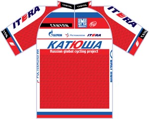 |
Run by the Russian Global Cycling Project foundation, Katusha has a significant Russian feel about its team lineup and the jersey continues that theme. It used to have a skyline image of the Russian capital Moscow and for a few years did a great job of merging the rider’s national team colours into the design. It’s a clean and crisp design that has been through a few stages to get here, including white and blue versions but with few red jerseys floating through the bunch they are usually easy to spot. It probably wouldn’t be your go-to jersey for riding with the gang but sporting a jersey like this, especially outside Europe would definitely make you stand out as someone who’s a cycling aficionado. |
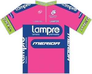 |
With the demise of T-Mobile, Lampre were left as the only team left in the bunch brave enough to wear pink. I spend my life telling haters that ‘real men wear Lycra’, but have not plucked up enough courage to add ‘pink Lycra’ in there too! It’s not the nicest of designs they’ve had over the years as lime green surely is the last colour in your pencil case that you would choose to when making alterations but that’s what adding sponsors to the list does. Now officially Lampre-Merida the bike manufacturer have their colours nailed to the pink mast. |
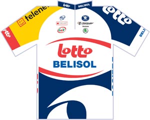 |
The longest running continuous sponsorship (that I can think of) comes in the form of the Belgian lottery sponsored Lotto-Belisol. Lotto have been sponsoring professional cycling since 1984 and the jerseys have been as varied as the co-sponsors they have buddied up with. Whilst this is not everyone’s ‘tasse de thé’, it’s bold blocky design works really well when seen with the shorts too. The asymmetric design is something rarely seen in sports team clothing, probably down to the way sponsorship space on the jersey is sold, but when done properly it can produce a great looking kit. Again one of my favourites if not only because it dares to be different. |
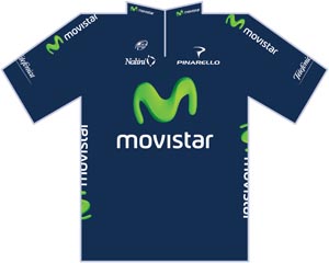 |
Movistar has evolved from the Banesto team and following that, the Caisse d’Epargne organisation who had arguably one of the sexyist kits of all time. Whilst the team colours are enforced by the sponsor, I’m sure whoever was in charge of the team stationary cupboard could have taken one less sleeping pill before sketching out their chosen design. Not a lot more to other than I’m exceedingly glad their riders are more exciting than their uniform. |
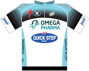 |
Quick Step is another name that has been around Pro cycling for many years. With the addition of Omega Pharma the team moved away from the standard red, white and blue design and punched it with the turquoise we see today. If I had to show someone an example of a beautifully thought out sponsor-led cycling jersey… this would not be my first choice but it would get honourable mention. The team sponsors will be pulling their hair out now Mark Cavendish has won the GB National Road Race and will spend the next year in anything but the team colours! |
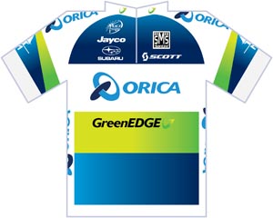 |
Despite their finish-line-busting shenanigans on Saturday, the Orica GreenEdge blokes seem to be the life and soul of the bunch and thankfully that is reflected in what is fast becoming one of my current favourites. It’s not golden yellow but somehow it feels pretty Aussie and they have also done a good job over the last few years of incorporating the national champion colours of some of their riders into the design. As so many other teams have, I’m the sponsorship of this team will evolve over the years so don’t expect their jerseys to stay the same for too long. Saying that, I reckon they’ll always be pretty smart and good looking jerseys. |
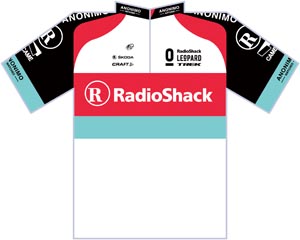 |
Radioshack… Leo-pard Trek… Nissan… don’t try trace the lineage of the current Radioshack-Leopard, it’ll hurt your brainbox. The jersey design has been pretty settled over the last few years and although the colours work really well and are pretty visible, everyone has forgetting they were originally going to be an unofficial Luxembourg national team of sorts. Of course Johan Bruyneel’s crystal ball was full of other horrible future events that would happen in his career and he didn’t see the ridiculousness of the venture. Thankfully the team appear more settled now and have a solid looking jersey. Another clean and smart design, it’s only let down by one particular rider who made a comeback and tainted the brand in my own mind. |
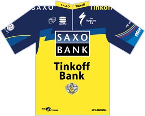 |
Another team with a successful as well as colourful history and lineage, who would have thunk so much yellow would work in a team jersey. The Saxo-Tinkoff design (thank eff they got rid of all those banks from the name) will never be a classic but it did at least get rid of the awful Saxo Bank-Sungard ‘penis eagle’ which we can all be grateful for. |
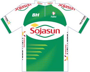 |
A team that’s only been around for a bout 4 years but they have had some nice kits in that time. With previous sponsors, Saur leaving last year the team have moved to this green uniform. The old Saur-Sojasun kit was a particular favourite of mine but I’m not sure about this number design. Interestingly the Sojasun predecessors were the first Pro Tour team to incorporate a ‘trash pocket’ on their jerseys to prevent the riders from having to toss their gel wrappers and food onto the road. Nice work. |
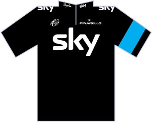 |
What can you say. It’s not just because I’m a Brit that I like this. It’s because it’s bloomin’ yummy! If you were to pick a Rapha off a tree and cut it in half it would look like this. A class of jersey that many have tried to emulate in the past but finally someone has pulled it off. It’s not necessarily my favourite but Team Sky’s jersey sure is classy… if not a but hot! |
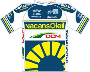 |
Again another newish team who have kept a fairly consistant type of design over the years. This year it’s quite a busy jersey and there is lots to take in but it works. Vacansoleil are known for their attacking style and their kit does a great job of hitting you between the eyes. It’s a great looking uniform and is the next on my shopping list! |
Let us know your favourite jerseys of the bunch and post some photos of your own local jerseys. Enjoy the Tour!


Dude that is an awesome reference for me while watching the tour! I get them confused easily when they just do quick pans or shots of the peloton. Thanks Stevie!
It seems there is just so much for the riders to worry about…They are a fashion show at times. Makes me laugh. I get a kick out of watching it now, lost it’s luster I think for me. I have become a “basher” of sorts I guess, poking fun at it more than enjoying it. I like to find the humor in it though. Brian Bruns has a book about RAGBRAI, which is different than the tour, but quite the ride. Rumble Yell is his book, info at his site http://www.briandavidbruns.com/BDB/Rumble.html. He tells a great humorous story of a pair of friends on a 500 mile ride across Iowa, it’s brilliant. I wish a Tour rider would write such a take on the Tour!