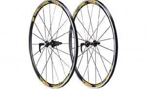
Reinventing the Wheel
 I wonder what today’s cycling races would look like if riders were still using those bone shaker steel wheels from the 1800’s? Not a pretty site now is it? Well, lucky for us the bicycle wheel has continuously improved, and improved further in order to provide us with speed, comfort, and better performance.
Loving the Bike has also been doing some upgrades itself. Over the past couple weeks you might have noticed a change to the look of our site. We’ve thinned up the top banner so that more of the content appears before having the scroll down the page. The layout has gone in for some surgery in order to give it a cleaner and more youthful look, the font has changed, and the sidebar has been tightened up…..all in an effort to make the site more reader friendly and enjoyable to navigate through.
There’s been some other cool features such as the slide out “Nutrition Tips” tab and the addition of some great causes that we support. We’re happy with the redesign and owe a huge thank you to Blairmore Media for their help in all of this.
But what’s most important is finding out how our readers feel. We want to provide great content that makes you want to keep on coming back for more, but along with that we want to make things visually appealing and easily navigatable as well. How are we doing? You know we like to keep it real over here at Loving the Bike, so hit us up with your honest comments. We can take it. Let us know what you like and what you think should be changed.
Our ears are wide open and we’re looking forward to hearing from you.


yes
Reinventing the Wheel
Nice redesign of the blog, Darryl! Much easier to navigate.
Thanks Bike Noob….I appreciate your feedback. Glad to hear that it is easier to navigate through.
Darryl
Well timed blog. I was so going to shoot you an email to let you know that I LOVE the new look of the site. I think the little [Nutrition Tips] tab is in a good place without being in the way. The new layout is what I call friendly-professional. It’s A LOT of information without feeling like A LOT of information. It doesn’t overwhelm, very nice flow.
My favorite is the Grid View of a few of the most recent blogs, directly below the current blog. Also, if I were a blog sponsor I’m sure I’d like my location on your site. I don’t read ads if I can avoid it, but these are so unobtrusive that it made me curious enough to click away and see what they were about.
The “You Might Also Like” links is smart touch and the organizer in me appreciates that the CATEGORIES is in alphabetical order. It’s the little things that counts the most o-o
Question: Does [NUTRITION TIPS] sound funny to your ears? Are they [NUTRITION TIPS] or, are they [NUTRITIONAL TIPS]? Food for thought.
“Keep ridin till the wheels fall off”
Great review and feedback, Lee. Maybe you should become a professional blog reviewer….hahaha. I really do appreciate the great comments. We’re so happy to have you as a fan of our site.
Nice layout Darryl, although I did also like the previous color scheme. Funny you posting about wheels. I was in a hub workshop today…off to the wheelbuilders tomorrow, and hope to post on the subject myself when time permits.
Thanks Sabinna…….I’m excited to read your post about the wheelbuilders workshop.